


Brief
Data Portraits project is inspired by Giorgia Lupi. I created a design system that gave each response its collection of shapes, colors, and symbols to express the views and personalities of the participants. This project surveyed 21 students in the Composition II class and gave out different badges. Every element's color, position, and rotation revealed a unique response, transforming the participants' information into an artistic representation.
My assignment is to ask survey questions related to a topic. I chose the topic of electronic devices and got queries like:
1. What device do you use most?
2. What do you use it for the most?
3. What color is your case (if no case, then the device)
4. What is the average time you spend on it?
5. What category of app/website/software do you use most?
6. Do you have lots of apps/software on your device?
7. Do you want to change/upgrade your device?

Design system and pin making
I started researching Pinterest and Behance for ideas. I suddenly thought of the traditional Vietnamese pattern and studied it more deeply. After identifying the elements I preferred, I sketched them on paper to better visualize what I had in mind.

Design system moodboard on Pinterest
I divided the pin layout into three parts; the central part is in the middle, the background, and the second part is a small icon. The Four Holy Beasts inspired my design, four typical animals of East Asia (including Vietnam) are Dragon, Qilin, Turtle, and Fenghuang (Phoenix/Vermillion bird). They are the central part of the design. The background texture represents the five elements fire, earth, metal, water, and wood. The second part combines small elements commonly found in traditional art. My primary colors are also culturally bold, like blue, yellow, jade green, and magenta (it should have been red, but I chose magenta to be more harmonious.) Each question corresponds to one; on pins, each answer corresponds to a different pattern or color.
Sketches


Brainstorming and sketching


Final survey design
After I finished sketching, I designed it again in Adobe Illustrator. Next, I chose the Composition II class as the object of the study (my teacher also did the survey). At the beginning of the class, I gave each of you a survey, I collected them right after that and started designing based on my results. Printing and producing pins were also must-do activities; most interestingly, I made them by hand using a pin-making tool. These pins hold the participants' information, which is an excellent way of storing data.


Finished pins

Pin attached survey sheets

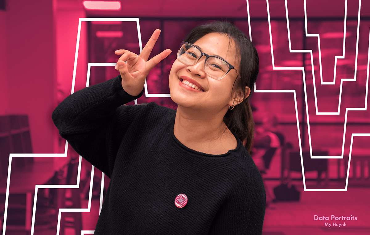
Participants with their pins


Poster designing process
Finally, I created a dynamic poster that summarizes my process and results. This time's approach is similar to the design system; I still consulted Pinterest and Behance to create the mood board, but it was a bit more difficult because the poster had to be designed about the design system. I wanted the central part of the design to be Four Holy Beasts taking up 3/4 or 3/5 of the layout. I divided each holy beast into a rectangular box ordered by rank and the characteristic color of that beast: Dragon (blue), Qilin (yellow), Turtle (jade green), and Fenghuang (magenta). The cutout effect was a great way to add depth and impact to the poster, even though it's 2-D. I also created four more styles, but in the end, the first one still attracted the most. I chose a black background to highlight the other colors of the poster. As for the text, I divided it into two parts, the title -subtitle, and the description with a rainbow line. To make the title stands out on a black background, it must be white; I also added a multicolored drop shadow effect to increase the highlight without being too much. I put the subtitle on par with the title, and the description is small but enough to make others curious. Finally, at the bottom of the poster I places all the participants' pins.

Poster moodboard on Pinterest

5 poster sketches


For me, every design exercise is always a big challenge. This time I learned a technique to create a cutout effect and how to use the pencil and eraser tool in illustrator. At the same time, I also had the opportunity to learn a little about traditional art, which I always wanted to know. In addition, I also learned how to handle problems, such as how to be both impressive and harmonious. Initially, I put the title considerably on the poster. Still, I received the opinion that the title should be minor, delicately placed in the right place, sometimes small but still attracting other people's attention. I enjoyed the whole process, even though it was difficult.
This project received a AAF-NEA Silver Student ADDY 2024
Thank you!


